A NATURAL SPACE FOR EXPERIMENTATION
BRAND IDENTITY
LOGO DESIGN
LOGO MANUAL DESIGN
Natural Fiberlab, a company that is part of the Bamboo Hub group from Barcelona, aims to respond to growing market demands by offering high-quality products made from eco-friendly materials, as well as providing a platform for producing alternative solutions to traditional plastics.
With the ambition to create a space for research, testing, and production of models made from natural materials while maintaining a commitment to eco-friendly design, the initial workshop clearly revealed the qualities that the future brand should embody. The aspects of elegance and a nod to simplicity provided ample inspiration for developing the visual language. However, to infuse the brand’s core identity with an organic look, we needed to bypass the common stereotypes typically associated with representing natural materials such as leaves, flowers, or stems. Instead, we seized the opportunity to explore the structures of natural fibers from bamboo, coconut, and others.
BEYOND STEREOTYPES
A key aspect of creating the visual identity was establishing a color palette that, despite the brand’s positioning in the realms of research and sustainable design, remains easily distinguishable in a competitive environment. Rather than using conventional color schemes, we explored options derived from the natural pigments of plants and even skin—melanin. By deriving a primary taupe shade, we ultimately defined the identity as elegant and thoughtfully crafted.
LOGO UNDER THE MICROSCOPE
An analysis of the industry and the client’s activities led us to the visual characteristics of natural textures, structures, and especially plant fibers. By researching microscopic images of various plants such as bamboo, coconut, hemp, and cactus, we were able to define a starting point for shaping the future pictogram. We then translated dynamism and elegance into the form of the initial “N” for Natural, which best conveyed the idea of collaboration and flexibility. The resulting outputs were incorporated into a comprehensive brand manual for the company.
CONTEMPORARY FONT
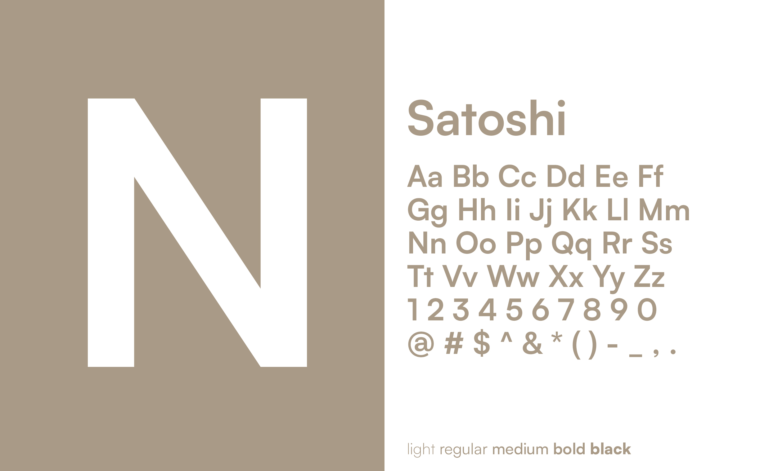
The visual design includes the modern, simple and elegant sans-serif Satoshi font with minimalist composition – even in thicker uses such as Bold, Black and Bold Italic. Functionally, the font is characterised by a typeface and properties that respect the linguistic specifics of other languages, including graphemes such as tildes, accents and inverted punctuation marks.
VISUAL LANGUAGE
Prev
Next


VISUALLY ATTRACTIVE OPTIONS
The new visual identity system also unveiled additional natural application possibilities that respect the principles of sustainable design, primarily through the selection of appropriate materials. Even business cards printed on recycled matte paper (300g) or items produced via laser cutting on cardboard or paperboard can be manufactured without further color adjustments, while still showcasing a visually attractive symbol.
ADAPTIVE BRAND ASSETS
Our solution and design manual for Natural Fiberlab also incorporated a visual representation of branding on apparel and merchandise, along with its application in the context of manufacturing processes. The logo has been successfully applied even on the least exposed parts of 3D printers, CNC milling machines, or laser systems. The brand’s visual assets have found unique expression both online and offline—for marketing purposes (website, social media, DTP, or business cards) as well as on products manufactured by Natural Fiberlab itself.